
ElevateHub
Sales Enablement & Training Platform
Design assessment completed for Moody's Corporation
ElevateHub is a fictional concept and is not affiliated with or endorsed by Moody's

About ElevateHub
ElevateHub is the internal destination for sales programs, product presentations, playbooks, and certifications. Sellers complain that it’s hard to find the right item quickly, the files that are “official” files aren’t clear, and managers would like a more clear insight on team progress.
This case study was a UX/UI design assessment for Moody's centered around a fictional product called ElevateHub.
Role
Experience Designer
UX Researcher
Software


Date
March 2026
Problem
Sellers complain that it’s hard to find the right item quickly, what’s “official” isn’t obvious, and managers lack at-a-glance insight on team progress.
Solution
Proposed goals to solve:
Create a clear, guided path for new employees & “Start here” list
Clarify which resources are official/current and which are outdated
Design a content detail view focused on product presentations
Create a dashboard for managers to view who has / has not completed training
Create a filtering system for managers to find resources per specific skill
Personas & Pain Points
Defining the problem, goals to solve, and user personas
Define the problem

The platform
ElevateHub is the internal destination for sales programs, product presentations, playbooks, and certifications.

The problem
Sellers complain that it’s hard to find the right item quickly, what’s “official” isn’t obvious, and managers lack at-a-glance insight on team progress.
Goals to solve
Create a clear, guided path for new employees & “Start here” list
Clarify which resources are official/current and which are outdated
Design a content detail view focused on product presentations
Create a dashboard for managers to view who has / has not completed training
Create a filtering system for managers to find resources per specific skill
User personas
Pain points & goals for each sales representative

Sales Rep A
(Ramping)
Needs a guided path (what to do first, then next)
Overwhelmed by choices; wants a short “Start here” list

Sales Rep B
(InFlight)
Needs to know what’s official and current within their business segment
Wants quick access to Product Presentations for an upcoming meeting

Sales Rep C
(Manager/Coach)
Needs to find relevant coaching for reps who need a specific skill
Wants a dashboard showing who has / has not completed training
Information Architecture & Flows
Mapping the platform’s pages and user-flow experience
Information architecture
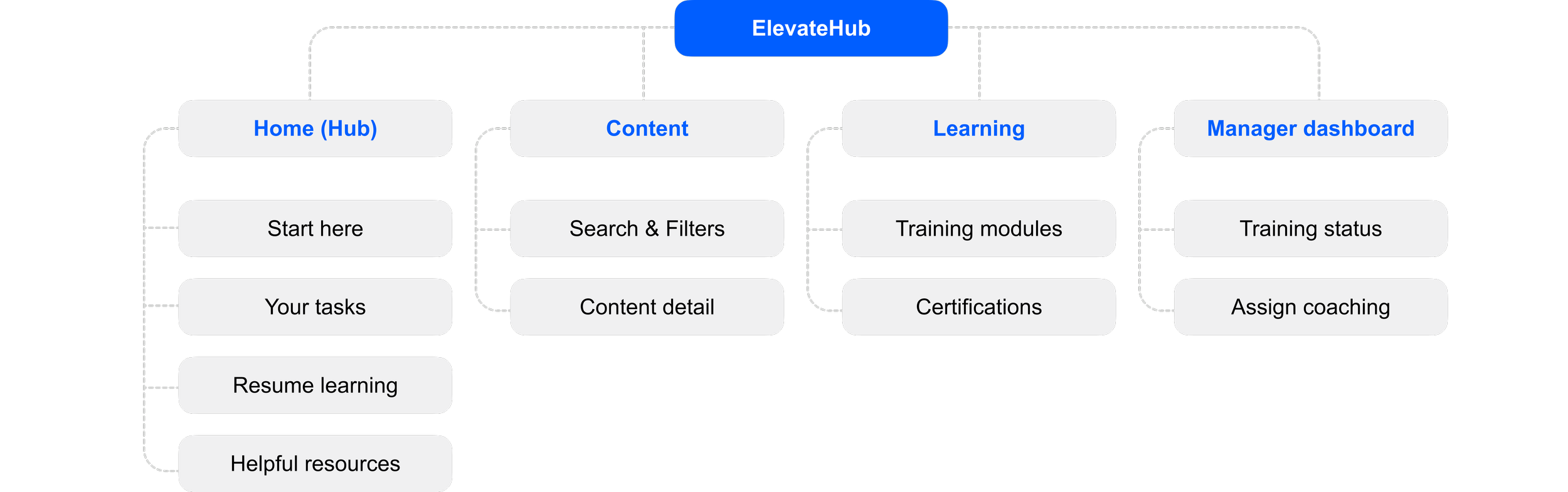
User flow 1
Sales Rep A: Ramping

User flow 2
Sales Rep B: InFlight

Wireframes
Mid-fidelity and Hi-fidelity wireframes
Mid-fidelity wireframes
Hub homepage
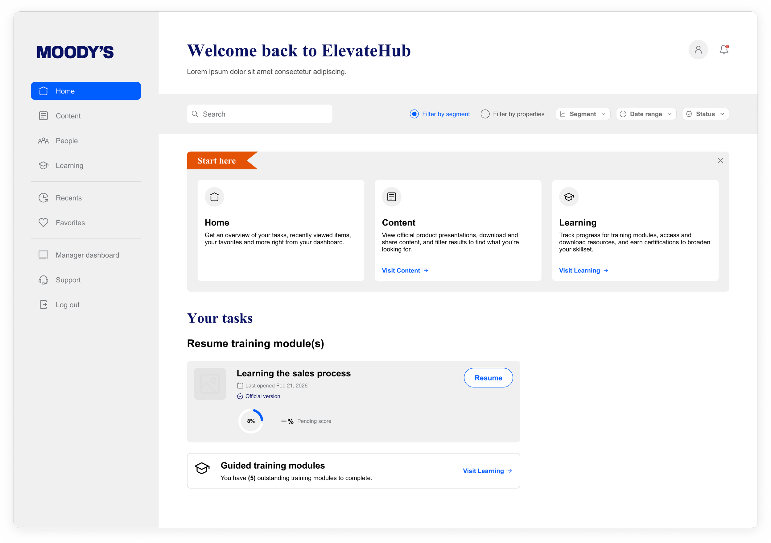
Content detail
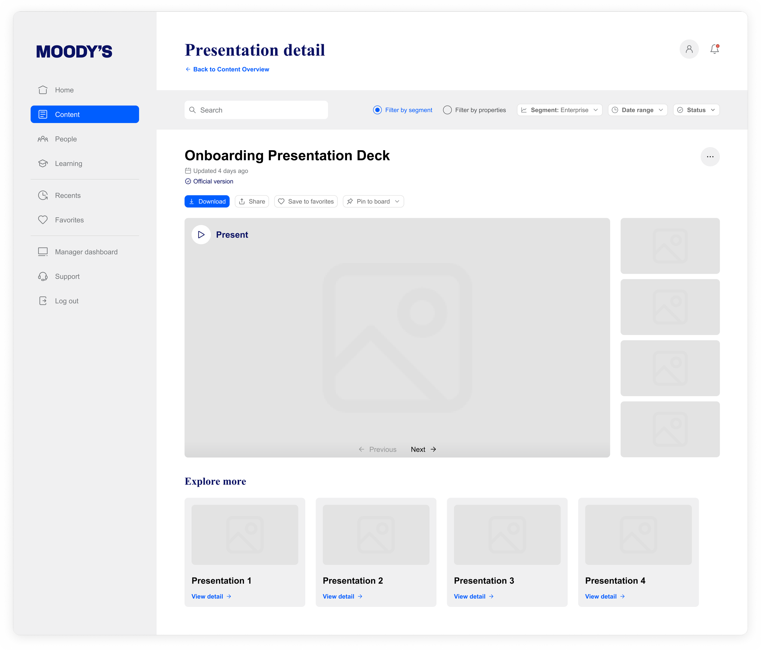
Manager dashboard
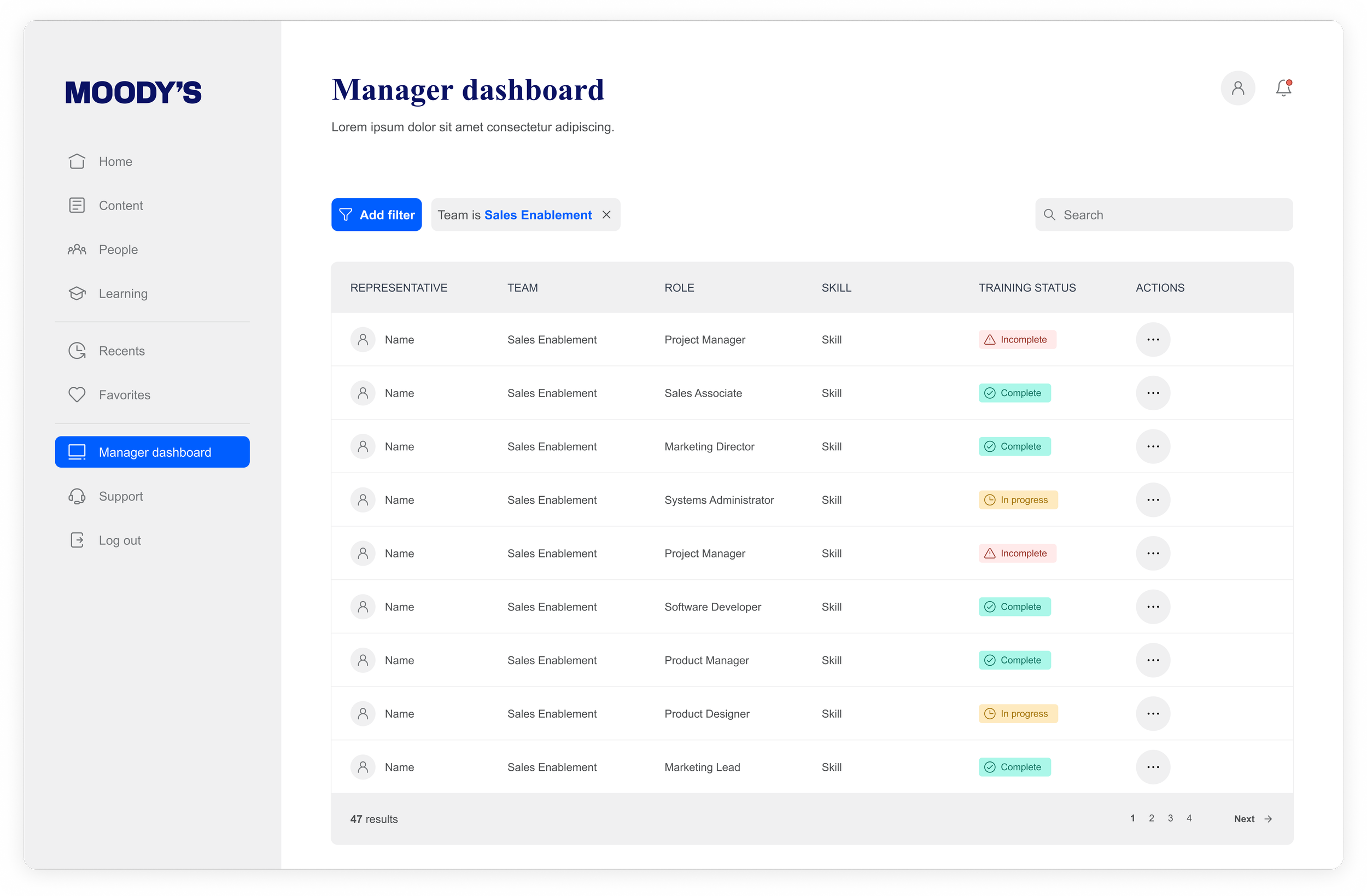
Hi-fidelity wireframes
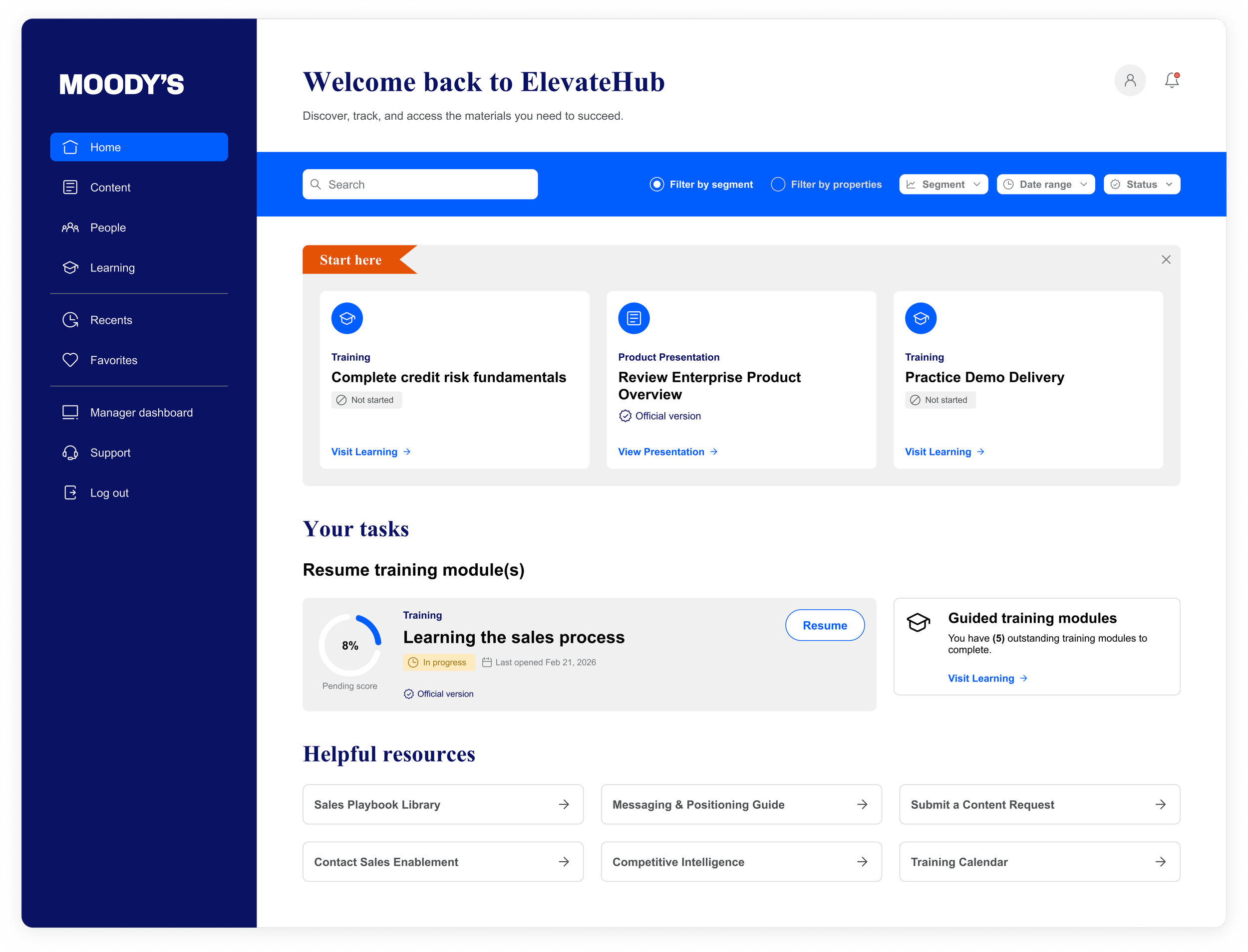
Hub homepage
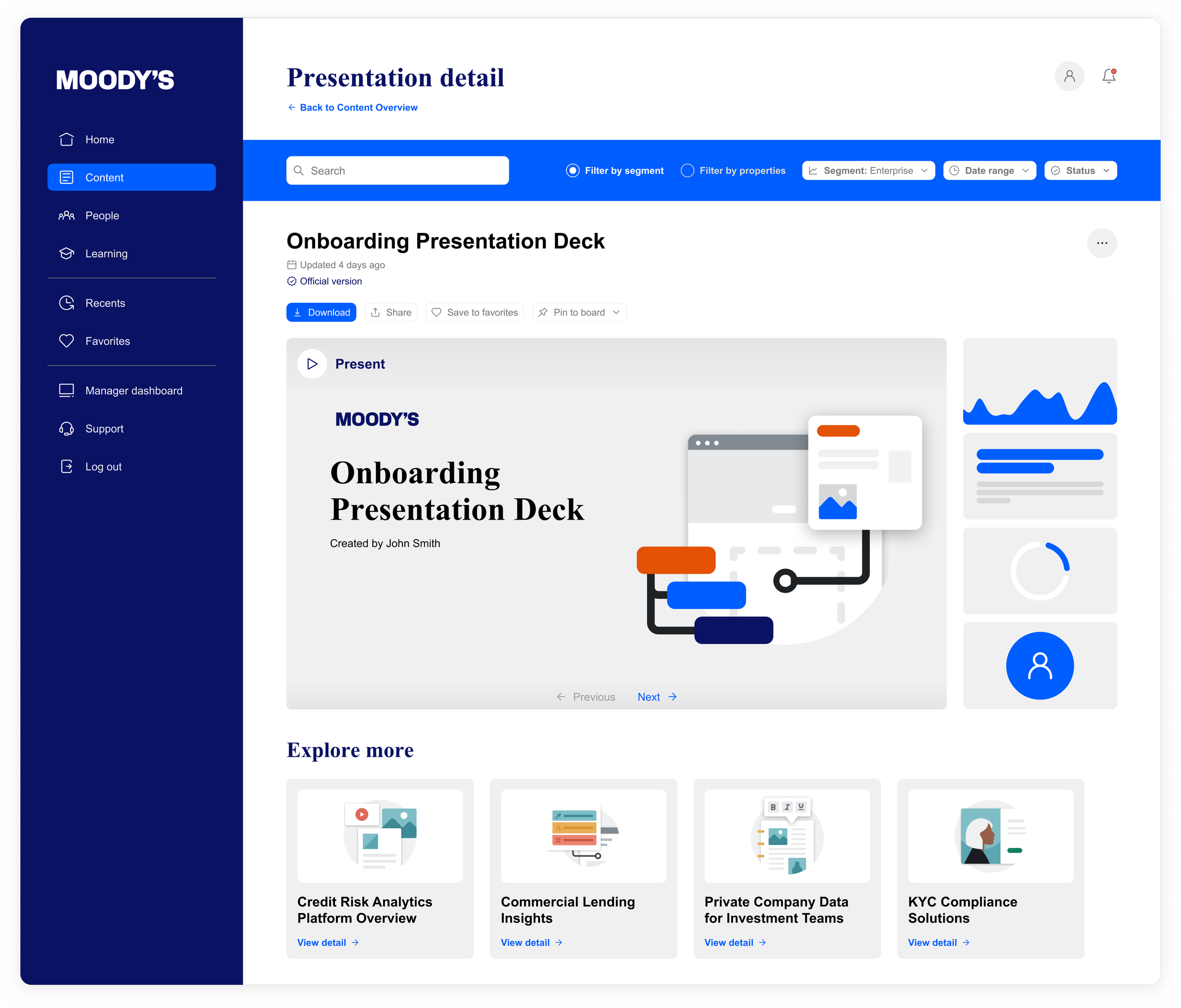
Content detail
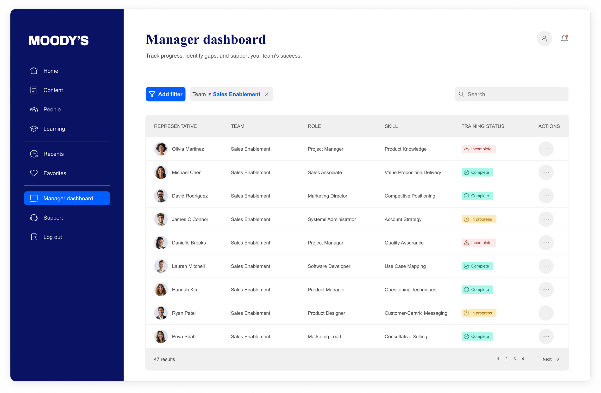
Manager dashboard
Brand Application
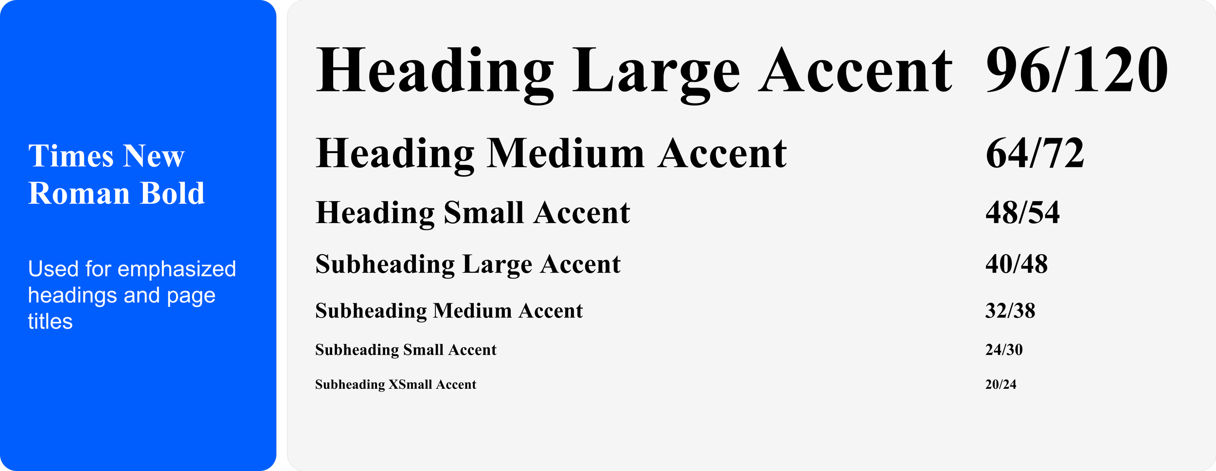
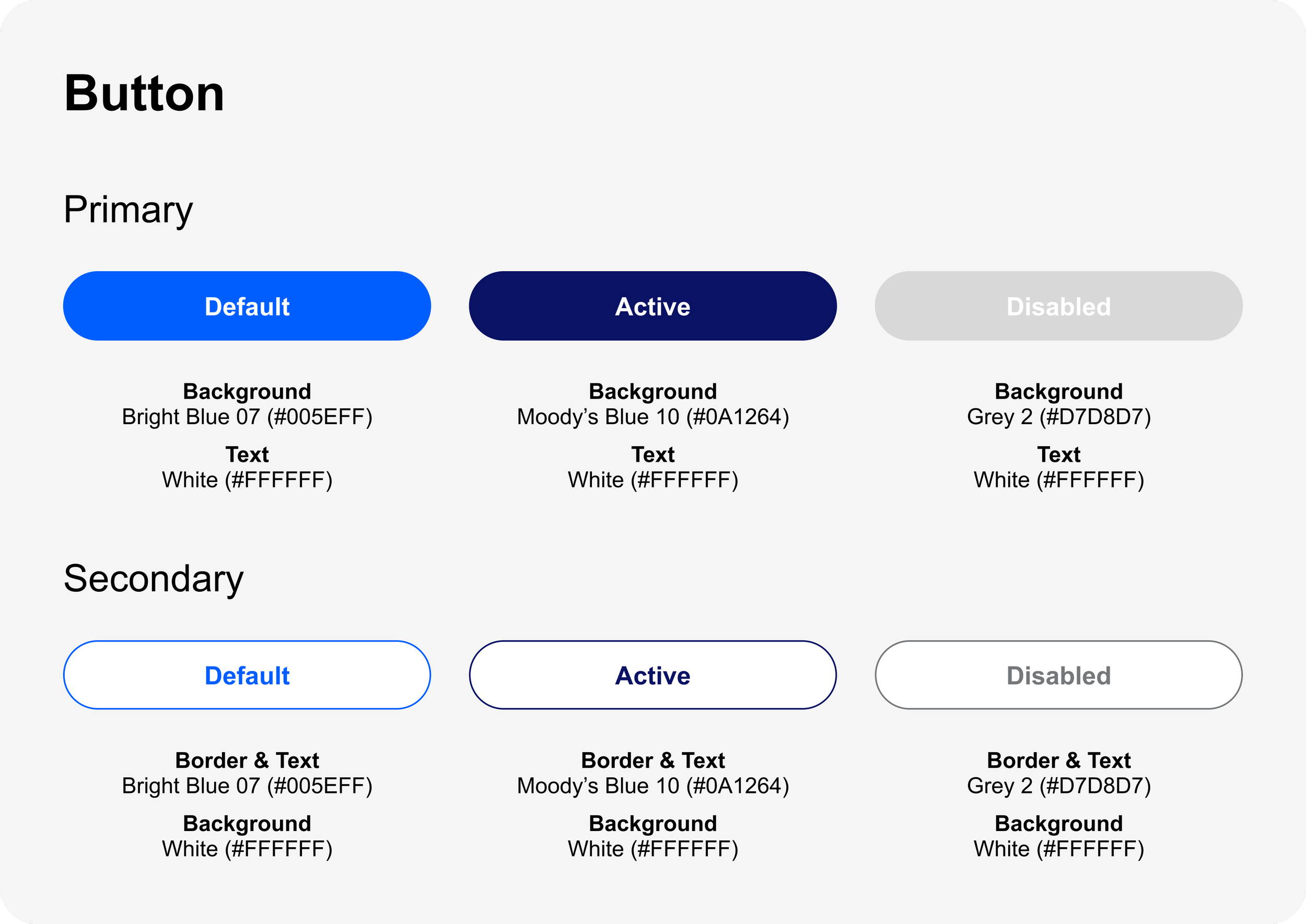
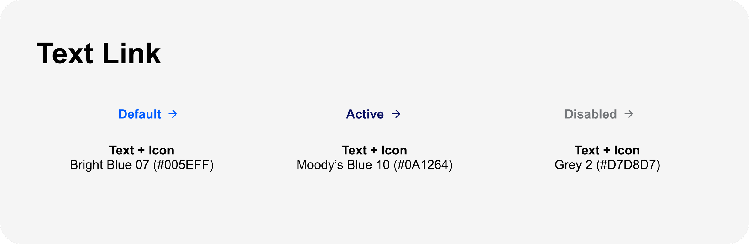
Typography sizes, CTA states, logos, color palettes, and color usage detail
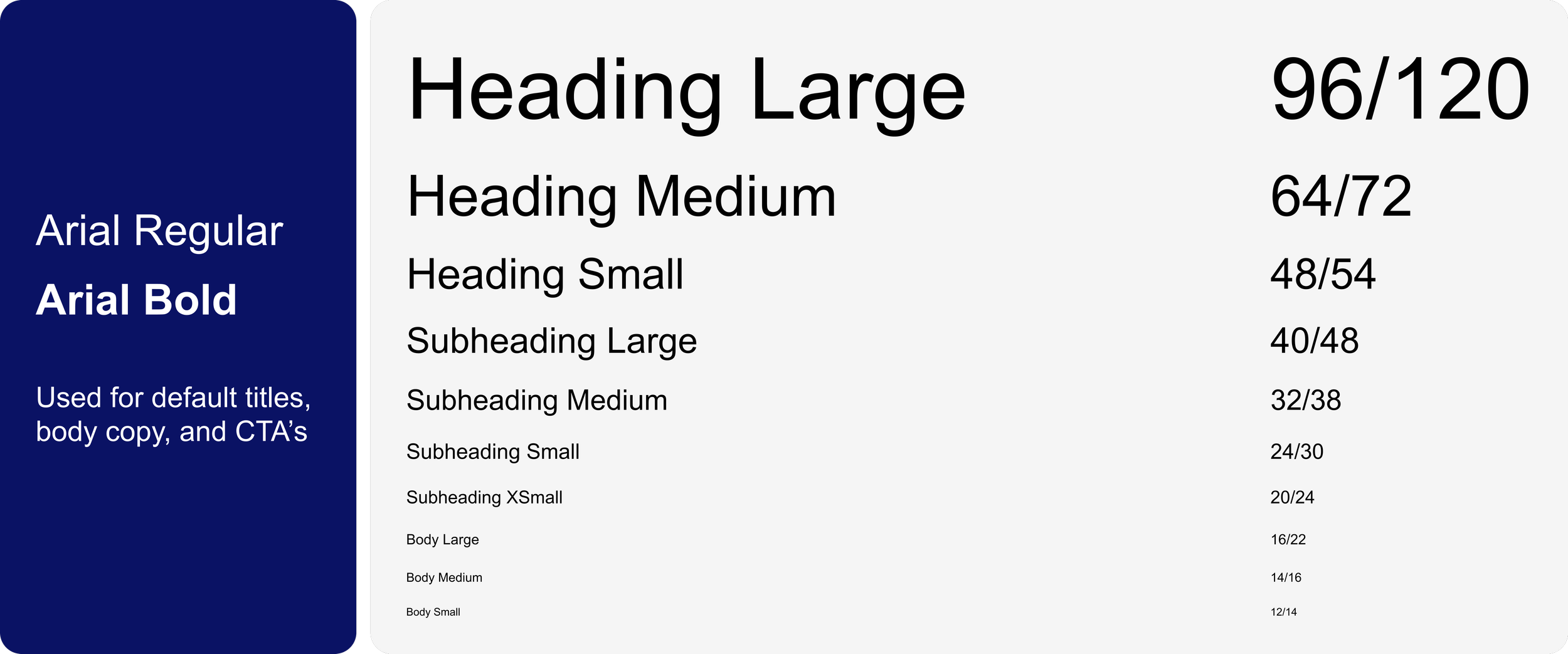
Typography sizes
Default
Accent
CTA states
Logos
As requested within the brief, I was given permission by Moody’s to use the approved logo they provided. In addition to this, I was given guidance to ensure sufficient contrast with backgrounds and not alter or create new lockups.



Color palette
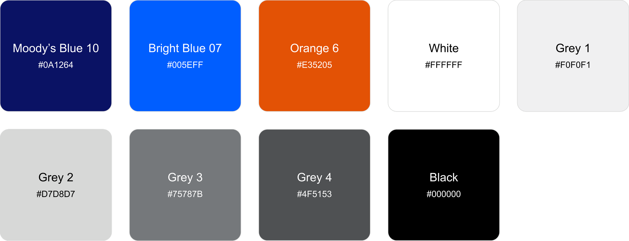
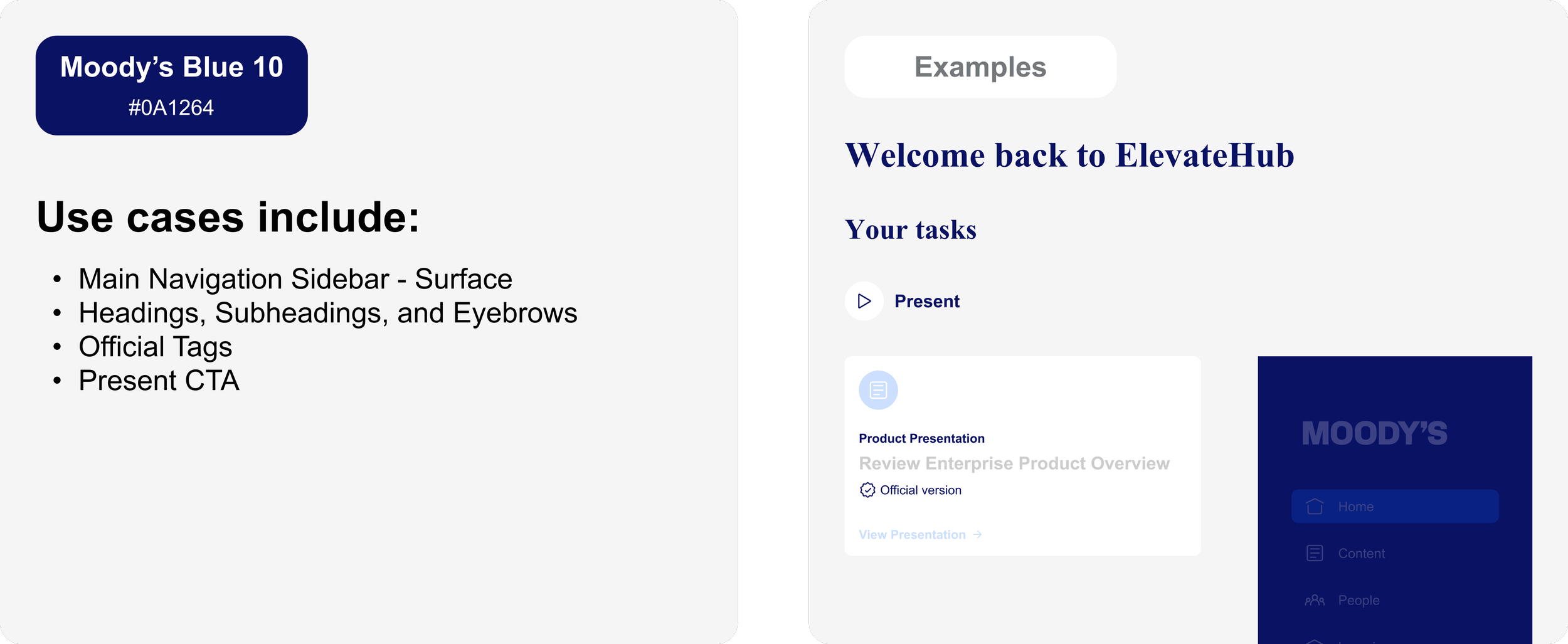
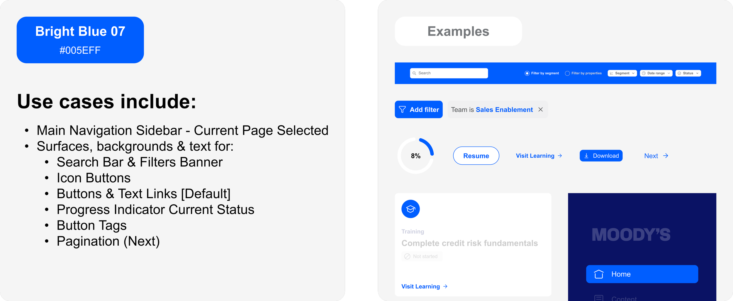
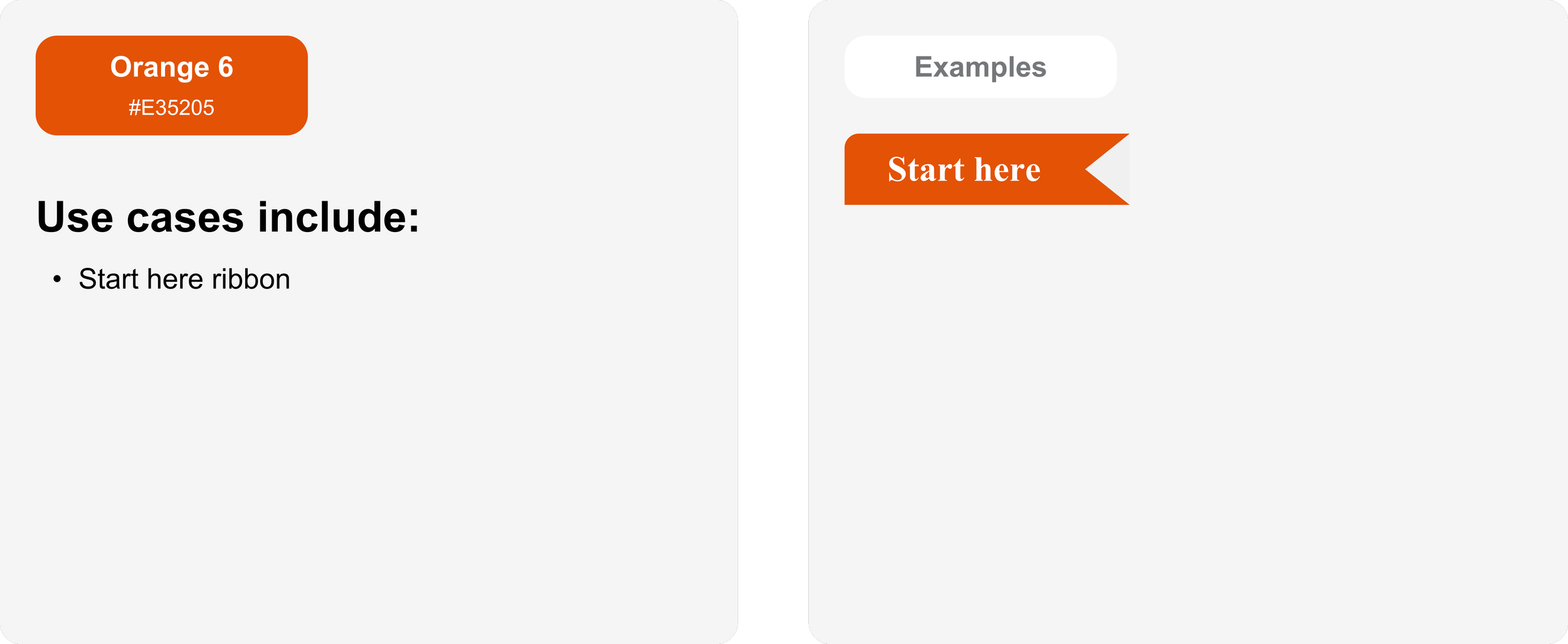
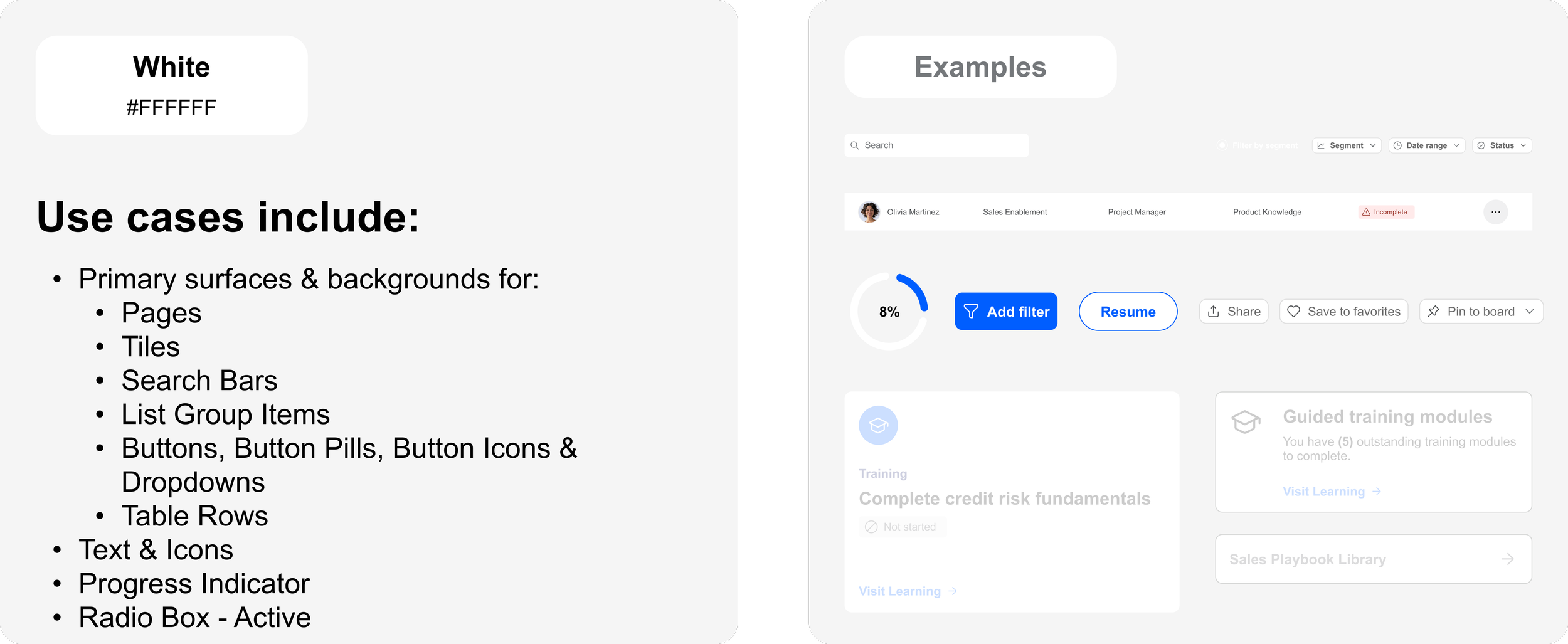
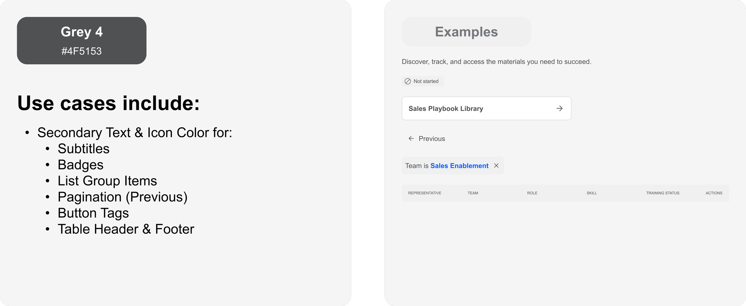
Color usage
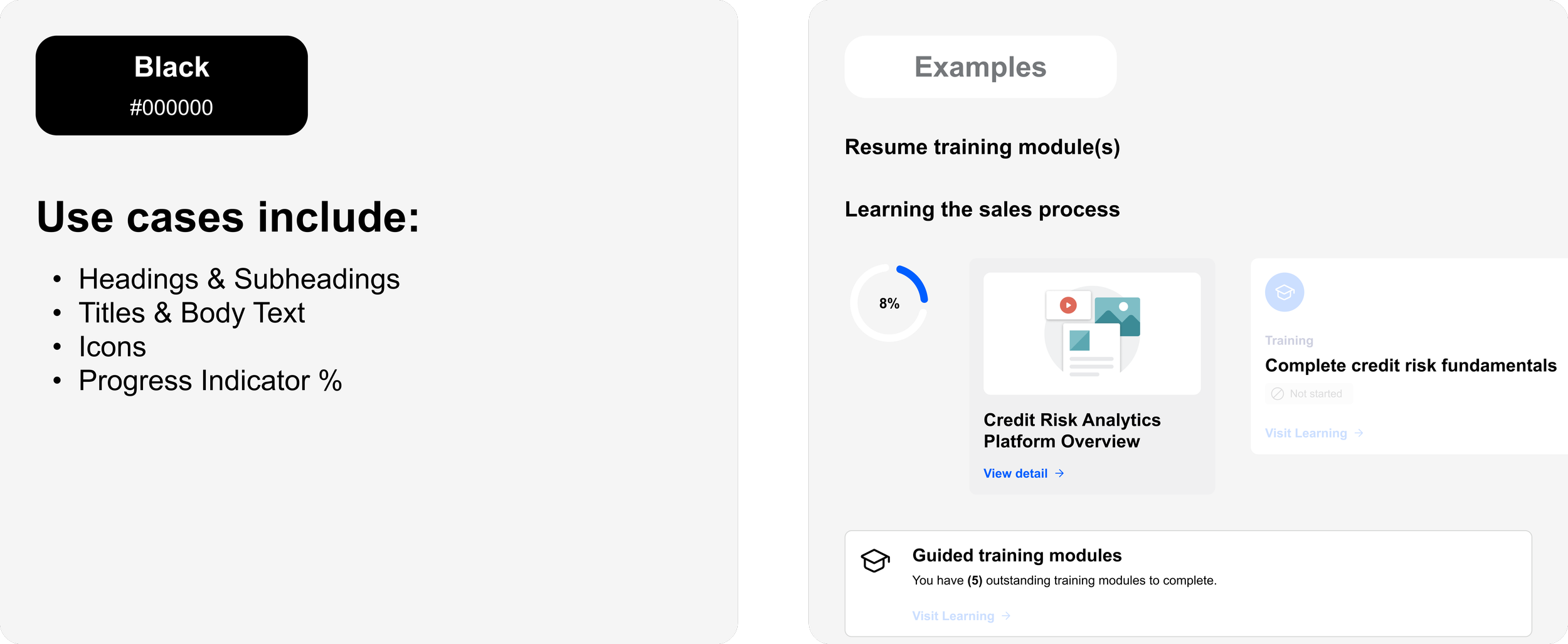
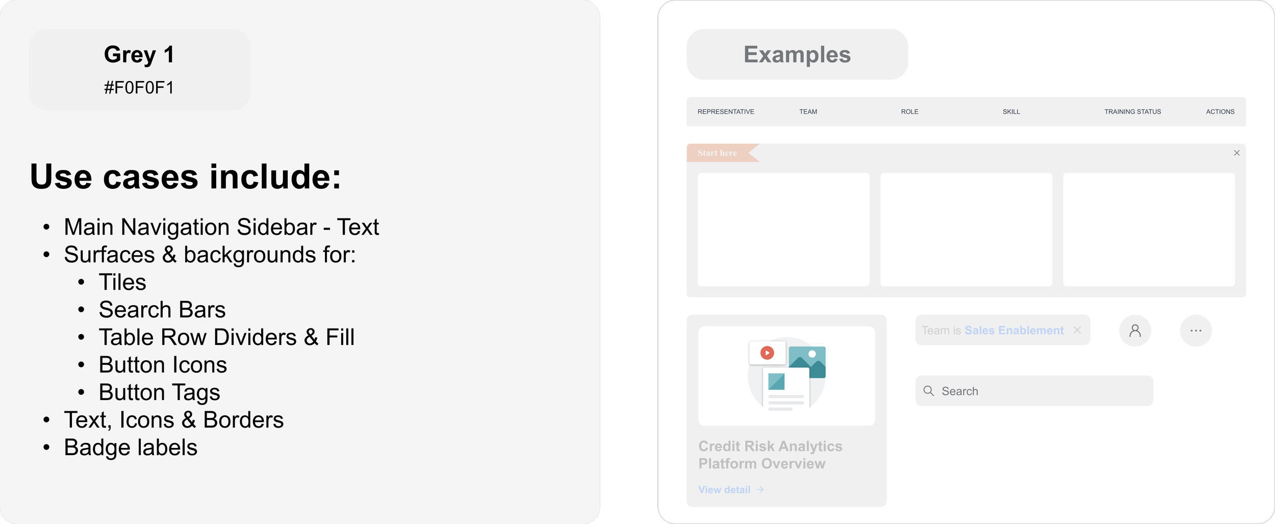
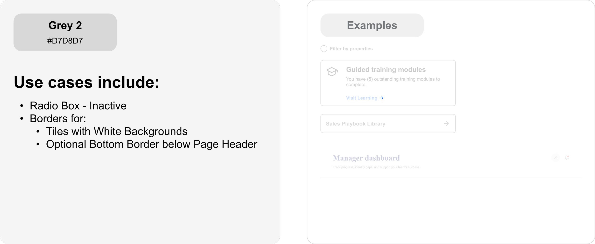
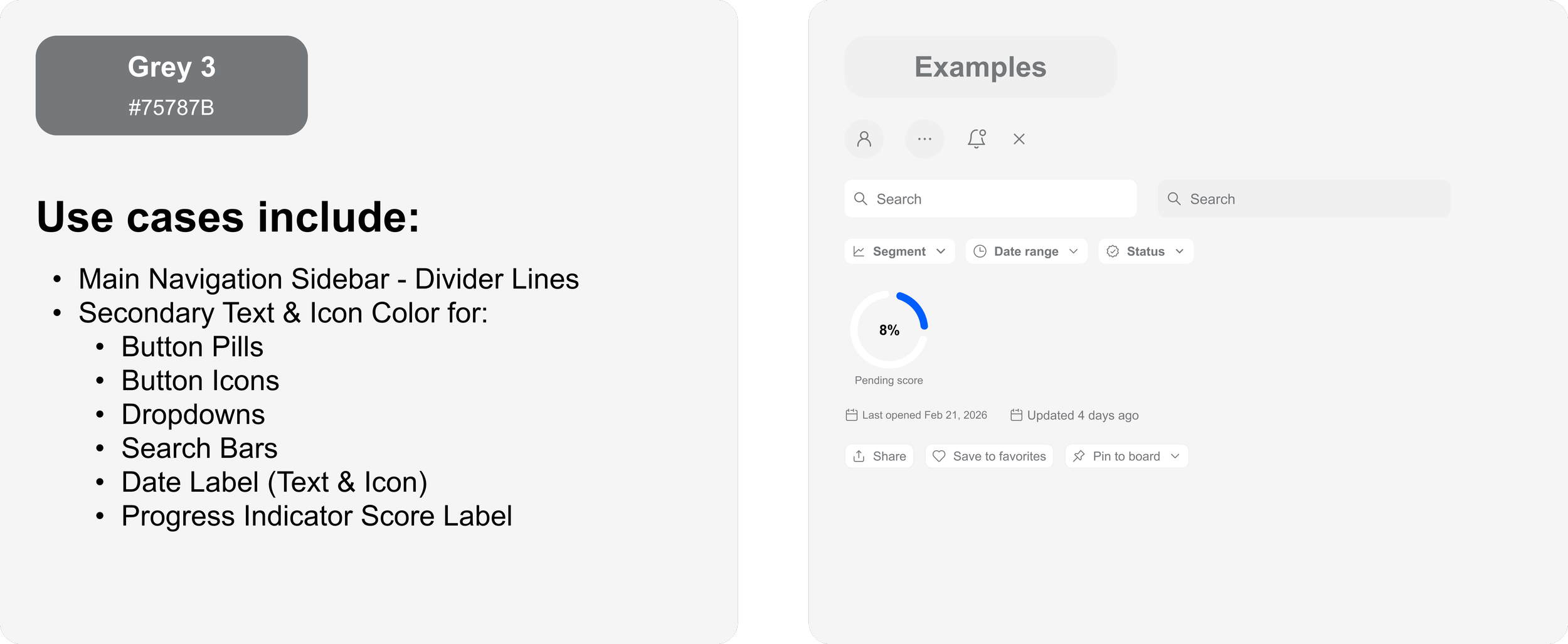
Rationale & KPIs
Design rationale and KPI measurements, reasoning and results
Design rationale
ElevateHub is designed to support two primary user needs: Helping ramping sales representatives build readiness efficiently and enabling in-flight representatives to quickly locate approved materials for customer conversations.
For Rep A (ramping), the experience prioritizes guided onboarding through a prominent Start Here indication that offers the user a list of recommended next steps. Progress indicators and “resume” states reduce cognitive load and help new reps build confidence as they navigate ElevateHub and complete their required training and certifications.
For Rep B (in-flight), the hub emphasizes speed and certainty. Segment filtering, clear content hierarchy, and highly visible Official and Updated verified labels with date stamps enable reps to quickly identify the correct materials for their audience. This reduces the risk of outdated or non-approved content being used in customer conversations.
The Manager Dashboard provides visibility into skill progression per team through scannable status indicators and targeted coaching actions. This supports proactive enablement and helps managers quickly identify and address skill gaps.
These design decisions aim to improve rep readiness, increase confidence in content selection, and support scalable sales enablement across teams.
KPIs
“Start Here” Engagement Rate
What it measures
Percentage of ramping reps who begin recommended onboarding items and training courses.
Why it matters
Indicates whether the guided onboarding experience is successfully directing new reps toward high-priority activities.
Result
Higher engagement suggests reduced onboarding friction and clearer next steps.
Rate of Locating a Presentation
What it measures
Average time for reps to locate and open a product presentation from the hub.
Why it matters
Evaluates the efficiency of navigation, filtering, and content discoverability for in-flight reps.
Result
Reduced time indicates improved searchability and faster sales execution & presentation deliverables.
Official Content Usage Rate
What it measures
Percentage of opened or presented assets that are marked “Official/Current.”
Why it matters
Validates that reps are able to confidently select approved resources due to clear page layout and content hierarchy.
Result
Higher usage reflects stronger governance, reduced risk, and improved messaging consistency.