
About Verizon
Verizon’s About pages are designed to explain who the company is, what it stands for, and how it creates impact—for customers, employees, communities, and the broader digital ecosystem.
Our company was contracted to redesign Verizon’s About pages to shift into a more human-centered, lifestyle-oriented brand narrative, as well as to align these pages to Verizon’s recent global brand redesign.
Role
UX/UI Designer
UX Researcher
VQA Tester
Software


Date
March 2025 -
Ongoing
Firstly, let’s discuss Verizon’s rebrand
As of 2025, Verizon launched a full international rebrand with a new visual identity called Monarch, delivering their brand promise to “power and empower how people live, work and play.” From improved design system usability to a refreshed voice and tone, Monarch was intended to bring their brand promise to life across Verizon’s digital products.
Transitioning to Monarch
Our first order of business was tackling a full audit of the About pages that Verizon leadership:
Found the most value in
Had the highest site traffic
Was outdated with the old brand version
Ultimately, we divided the selected pages, which ultimately came to over 30 total, into multiple sprints from MVP1 (most prioritized) to MVP4+ (least prioritized).
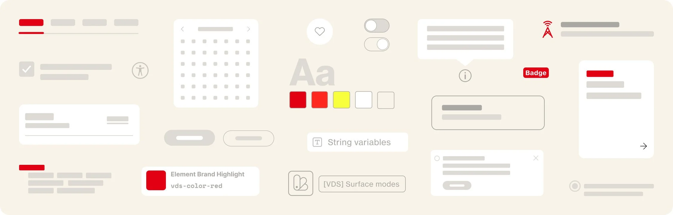
Creating reusable, scalable component blocks
After dissecting the About pages and compiling an information architecture audit, we determined that a large portion of these pages already follow similar building blocks and information.
Our game plan was now to work with our developers to create reusable component blocks, comprised of smaller nested components. These blocks were designed to scale across all viewports from mobile to desktop.
Reusable component blocks were crucial in both the design and engineering process to:


Bypass common remedial component design issues by determining CMS configurability up front
Reduce the design ➞ implementation process by 50%
Drastically increase the output of pages to an average of 5 pages per MVP release
About us (Homepage)
Verizon’s redesigned About us: Homepage is now live and available to view on their website.
Before redesign
Verizon’s About homepage was previously split between two separate pages: About us (Homepage) and Our company (Overview). After conducting competitive research and determining the information architecture of other companies and the type of information they included in their “About” homepages, we worked with Verizon leadership in deciding to combine Our company into About us (Homepage).
Using these pages as our base, we planned to continue highlighting the values and key-points that Verizon is defined by, including: Our responsibility, Our shareowners, Our employees, Fact sheet, Financial reports and filings, Careers and Innovation.
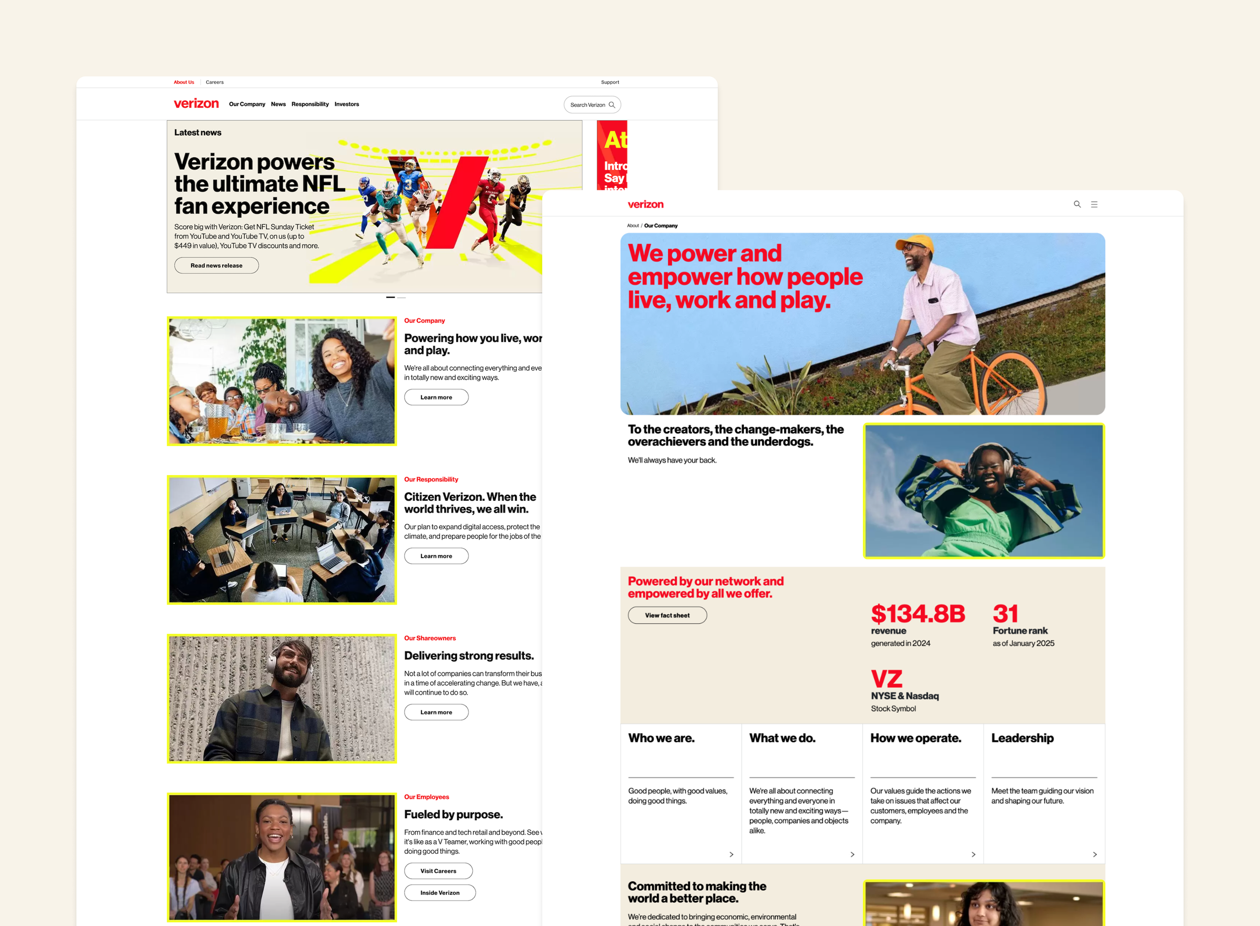
After redesign
Notable enhancements
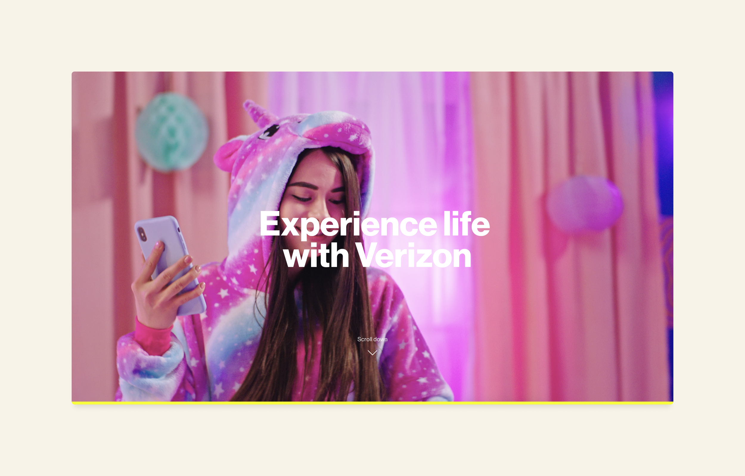
Fullscreen hero video
The Hero, which was previously a static image, is now a full-screen, looping video experience that engages the user when they visit this page.
Additionally, there is a “Scroll down” CTA with a down caret button icon for the user to click, which immediately scrolls them down to the next section.
Routing links logic
Routing links to other internal resource pages (such as Who we are, Careers, Investor relations, Our responsibility, etc.) now have their own respective sections with additional information, rather than them existing through only one small link.
Reusable blocks
The page utilizes different reusable sections that we call “blocks” in order to maintain a cohesive visual experience as we continued to design across multiple About pages.
Creating this system of component blocks has assisted us in delivering consistent designs in terms of typography, colors, border radii, and overall scalability across responsive viewports.
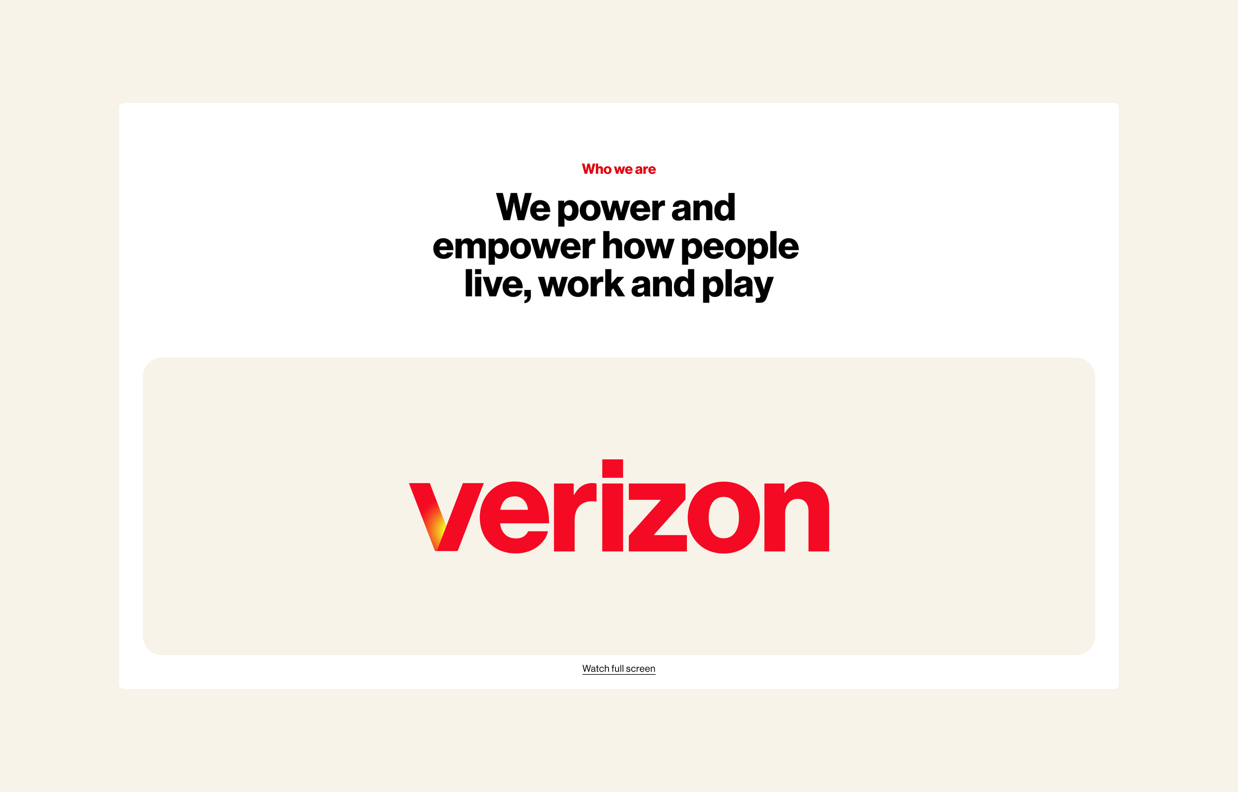
Who we are
Verizon’s redesigned About us: Who we are page is now live and available to view on their website.
Before redesign
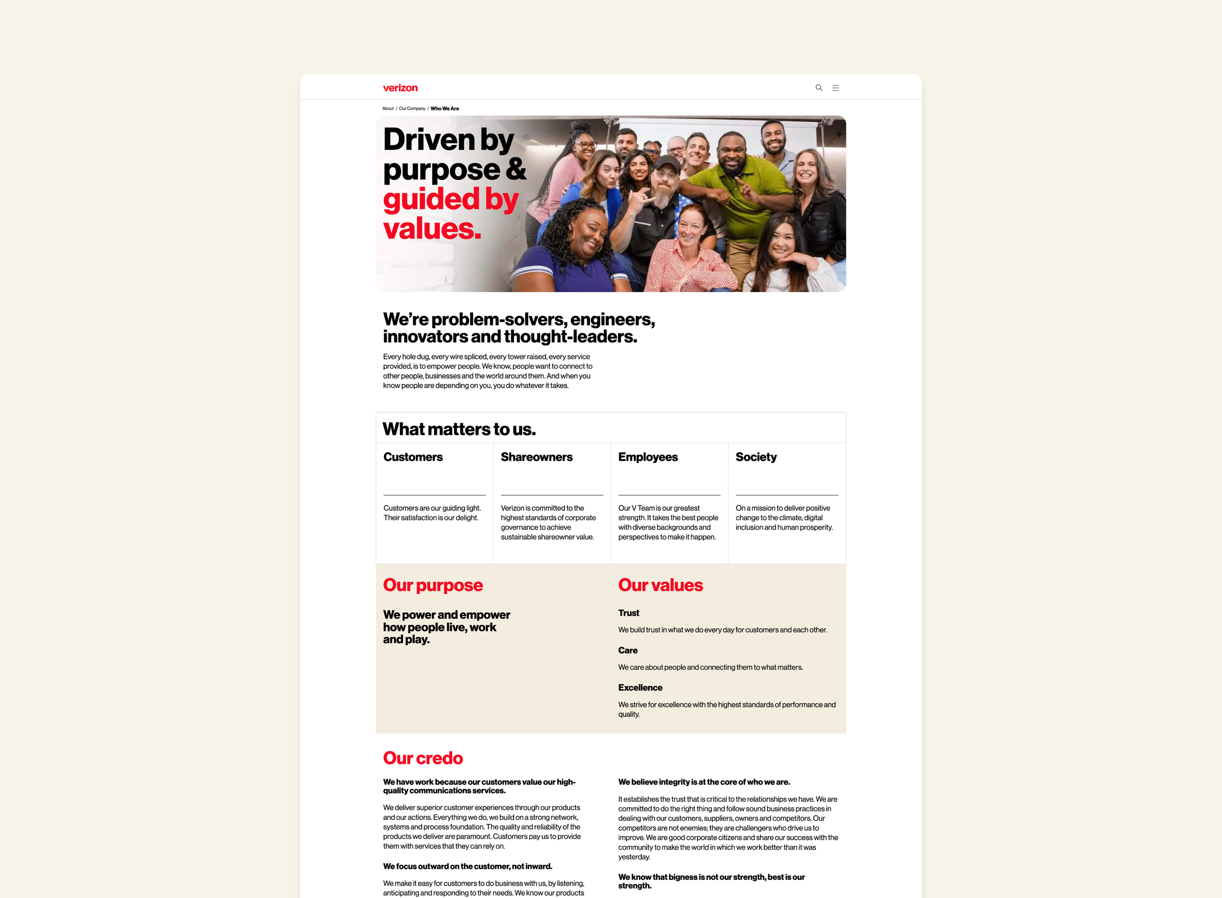
Verizon’s Who we are page previously functioned similar to the Homepage; static imagery, lack of visual interest, information without routing links, and outdated company information (e.g. “Credo”).
After conducting competitive research, we found that Verizon’s page was missing a few features that were common amongst other companies’ Who we are pages, such as company history, featured awards, and links to additional resources.
After redesign
Notable enhancements
Inline hero video
The Hero, which was previously a static image with text overlaying, is now a clear title above an autoplaying inline video.
Additionally, there is a “Watch full screen” text link below the video for the user to click, which opens a fullscreen video player experience with sound and video controls.
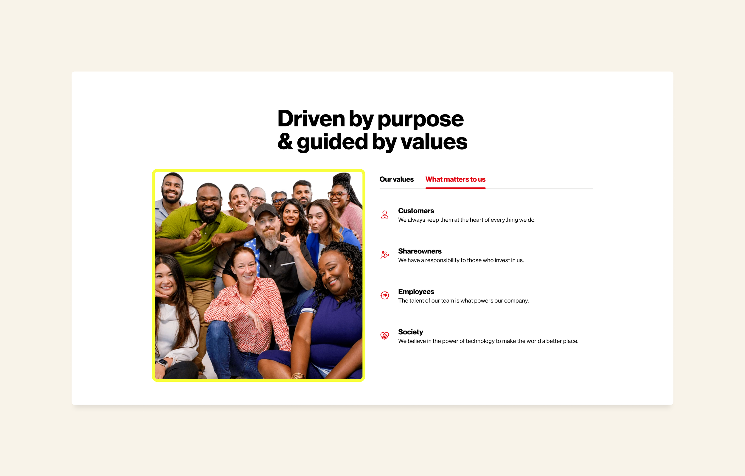
Diversity in presenting information
We created multiple different ways to display information to avoid visual redundancy across the page. For example, we decided to display “Our values” and “What matters to us” into two separate tabs, with informational list items beneath them. Each list item follows the format of a decorative icon, title and short subtitle.
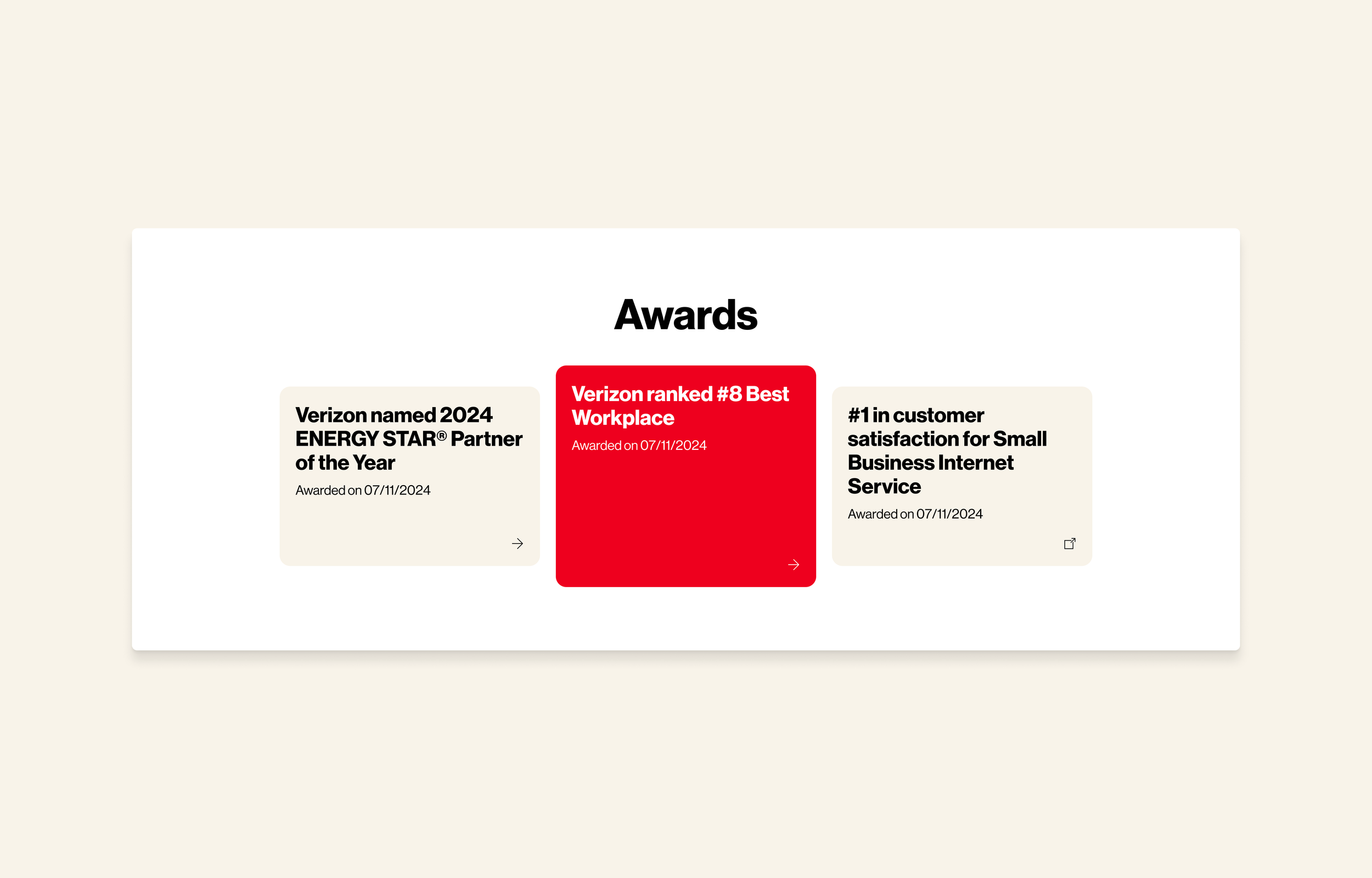
Showcasing Verizon’s awards
We added a new section to the page with featured awards that Verizon is proud to highlight. Each tile links out to an external page, routing the user to learn more about that specific award.
The purpose of this addition to the page stems from the results of our competitive research and finding that many companies take this opportunity to share the awards that they’re proud of, and we found that Verizon’s leadership agreed with this addition.
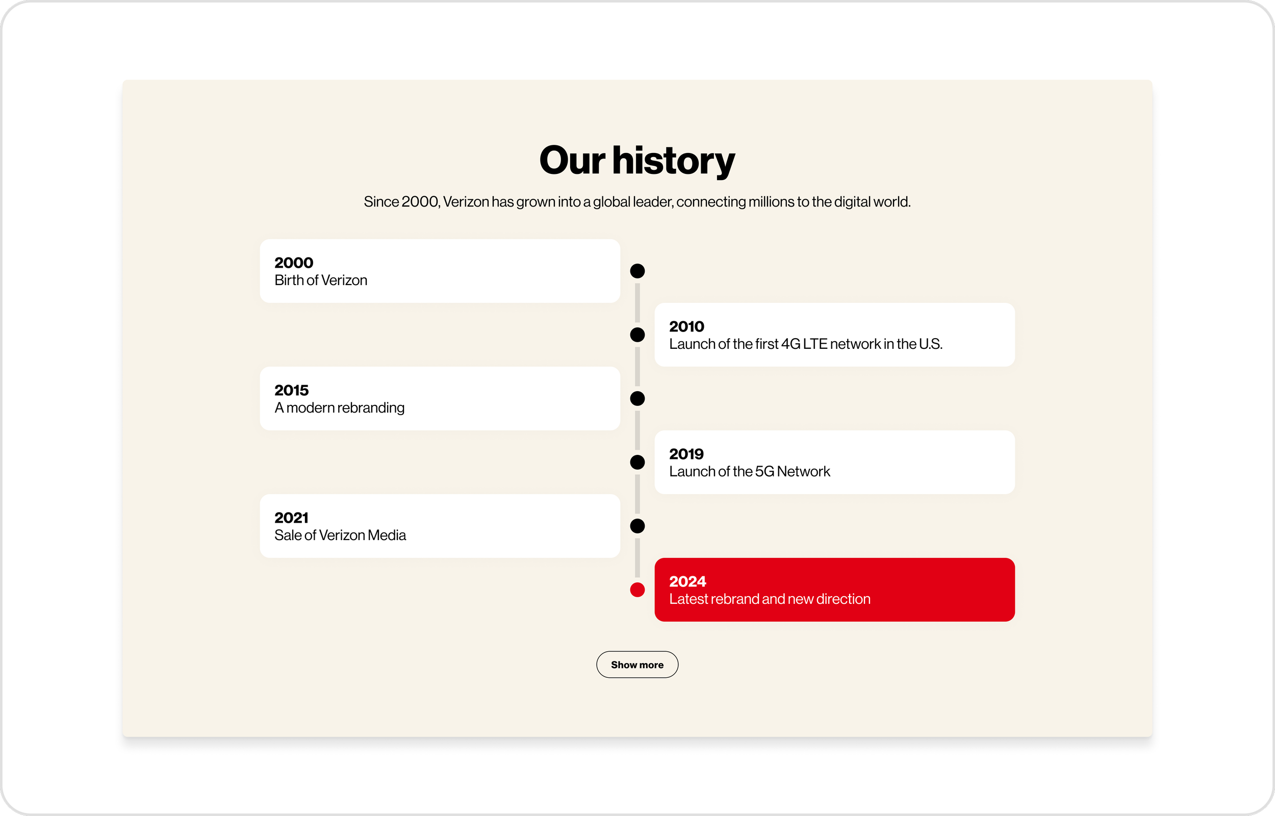
Addition of company history
Verizon’s history was previously on an entirely separate page, receiving little-to-no site traffic. In order to highlight the company’s history properly and align with similar competitor’s pages, we moved this improved history section to the Who we are page.
We repositioned the history markers into a traditional, vertical timeline, and utilized Verizon’s recognizable “Vibrant Red” to highlight the most recent history marker.
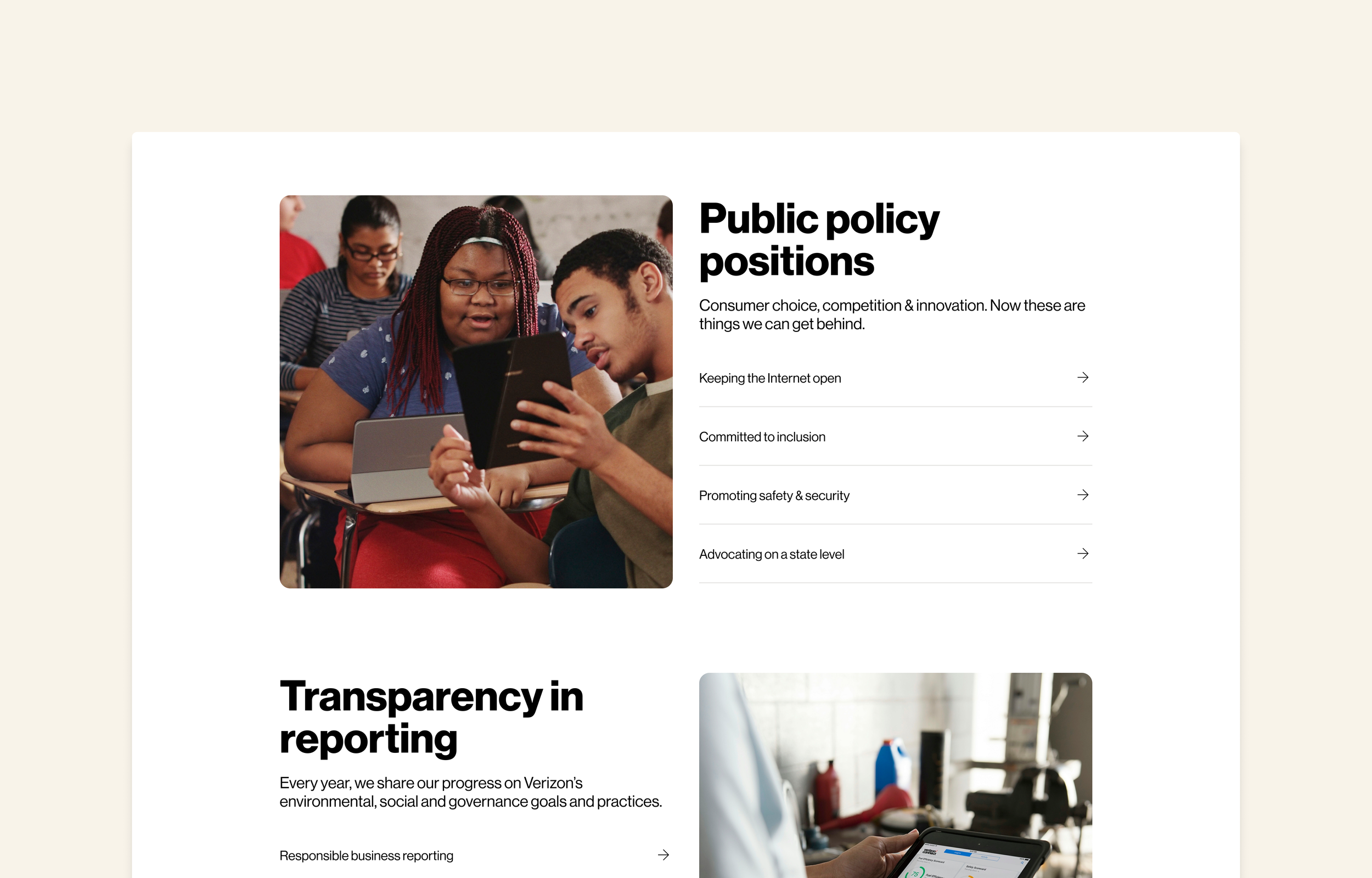
How we operate
Verizon’s redesigned About us: How we operate page (now “How we lead”) is now live and available to view on their website.
Before redesign
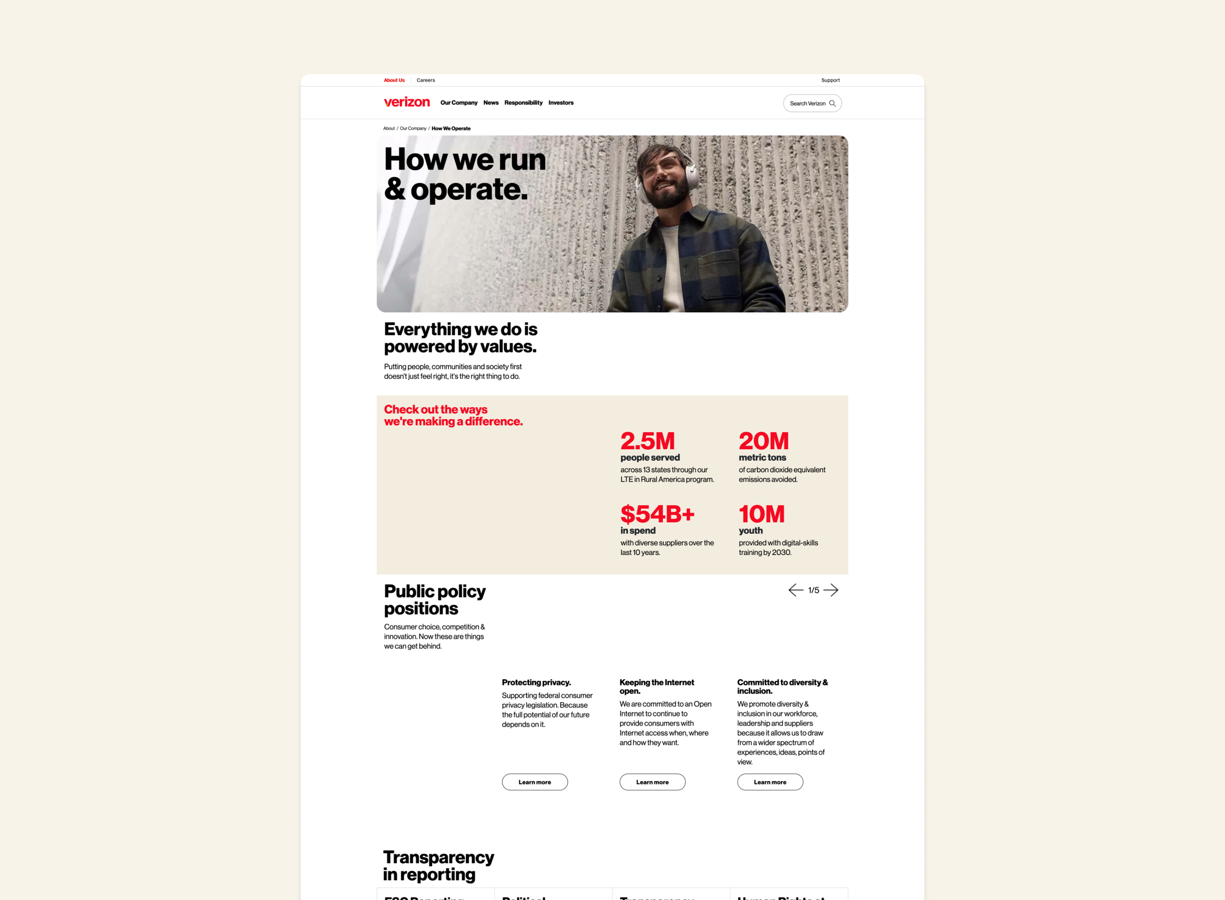
Verizon’s How we operate page (now “How we lead”) originally displayed flat metrics with little-to-no visual appeal. Much of this page displayed routing links with a short title, description and CTA.
After conducting competitive research, we found that companies often included more imagery into similar pages to keep the user engaged and interested with the page’s content.
After redesign
Notable enhancements
Navigational lists and imagery
Due to the number of routing links on this page, we needed to find a solution to display them all in a more engaging and organized way.
After numerous iterations, we found that using navigational list items grouped within their respective sections was the most optimal way to create this divide, yet maintain a cohesive layout amongst sections.
Including imagery as a part of these sections side-by-side with the list group acted as our way we could include more visual appeal on an otherwise metrics-heavy page.
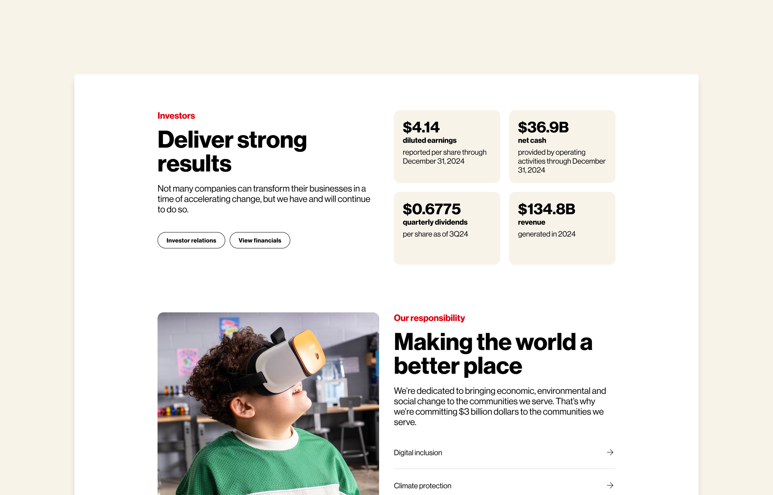
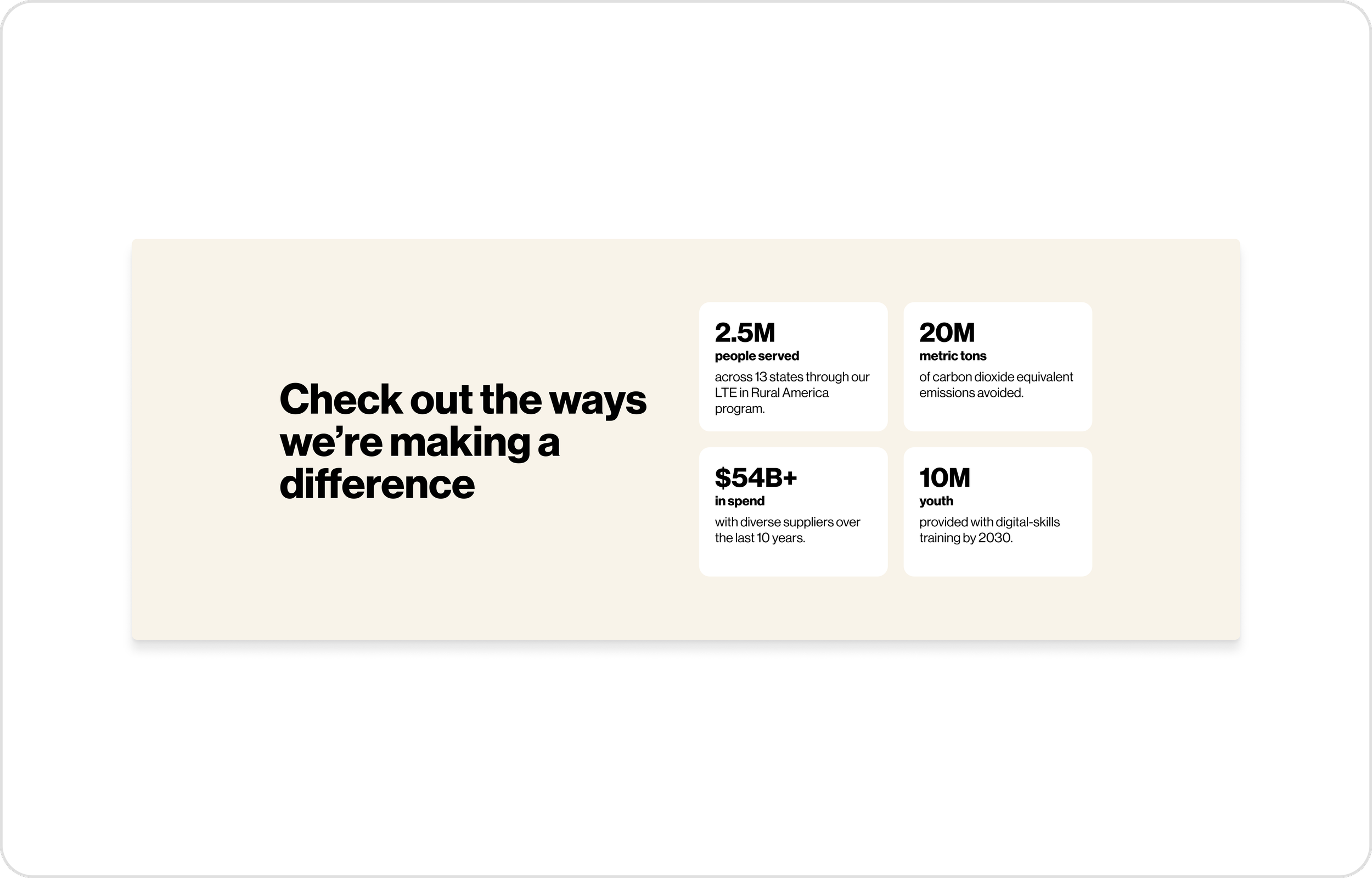
Cleaning up metrics
A huge standout of this page is the metrics of how Verizon is making a difference in their community. Because of this, we decided to dedicate a component block specifically to accommodate tiles displaying similar information & metrics to maintain cohesion across the About pages.
The text element hierarchy within the tile is as follows:
Using large, bold text for the metric value to emphasize how much impact was created
Adding a smaller, bold label below the metric value as the actionable element of what/who the metric value had impacted
Using regular weight text for the subtitle to act as the final descriptive factor of what difference was made.
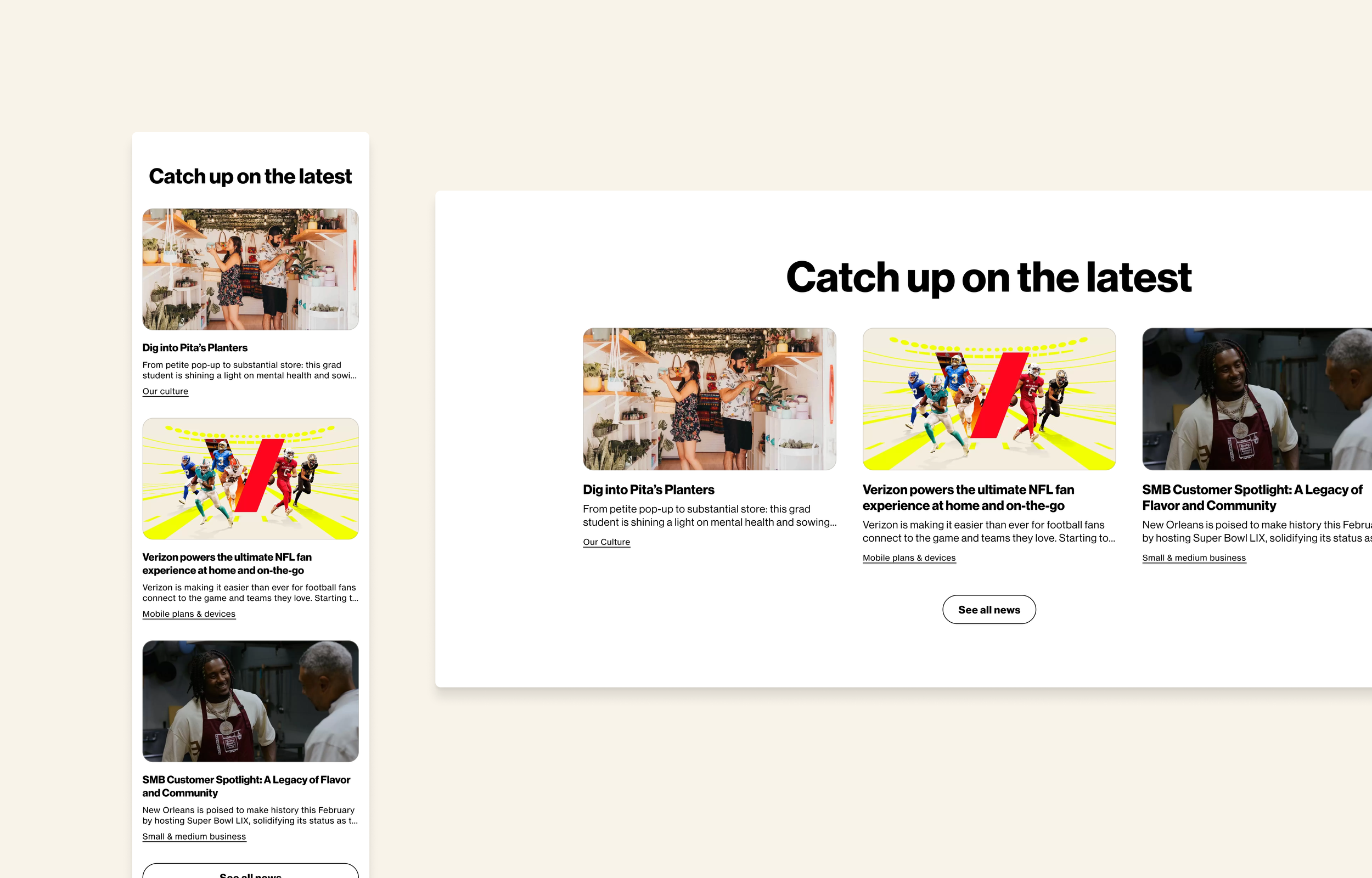
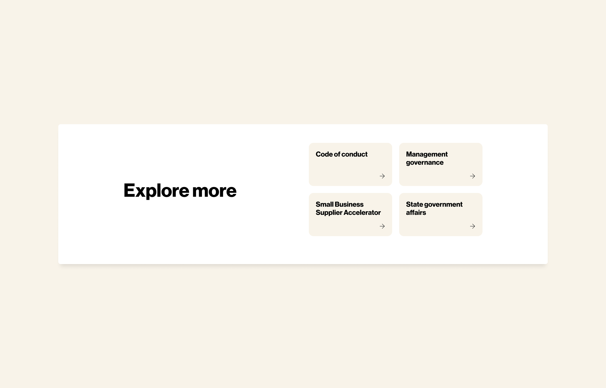
Navigational grids
This is another component block that we have created to reuse across pages, as it’s commonly used towards the end of a page to navigate the user to similar pages.
The simple design of this section was intentional to avoid bringing too much attention to the user to navigate off of the page too soon, yet still aligns with the page’s overall structure, padding, text elements, and layout.
Results
The purpose of Verizon’s rebrand into Monarch was to bring a new life into the visual identity of their products, and our implementation of the new branding has accomplished just that. In addition to executing the brand refresh, our redesign of Verizon’s About Pages have resulted in a more intuitive and visually interesting experience that these high traffic pages deserve.